Monday, August 20, 2012

The beginning of the end, or the end of the beginning

Either way, the next challenge is

beginnings

I thought of this a few months ago and decided that it was interesting and pretty wide ranging.
This was a quote I saw on pinterest and really sums up the topic, I think.  It also hints at cycles.  You can't have a beginning without an end, can you?
Some of the ideas I thought of were symbols like spirals, and cycles which always mean beginnings to me.  Like this.
http://www.thephotoargus.com/wp-content/uploads/2011/09/seashells02.jpg

and this
http://www.infovisual.info/02/img_en/045%20Life%20cycle%20of%20a%20cricket.jpg

and this
http://www.mehstories.com/spiral11.JPG

I thought of fossils from long ago, like this
http://static.bbc.co.uk/earthscience/images/ic/640x360/earth_timeline/cambrian_explosion.jpg

The tree of life, like this
http://www.astronoo.com/images/images_articles/arbreDeLaVie_small.jpg

Cells, the beginning of life, like this.
http://wakeup-world.com/wp-content/uploads/2011/11/cells-300x225.jpg

This image really summed it up. A bEGGinning, lol
https://blogger.googleusercontent.com/img/b/R29vZ2xl/AVvXsEh2hLgn_dC-puTrqld_o1nqB9SqSKehsQoucPJaA3GMwmPg1w9KXn5xo1cP-3cYgpGhCeI79AStXrRcXx_0Uh0BPoUEh11uZyeVDRy76linpEQWq7pNqpV0JFnk5kwhK4FXeoyYkkEWoIoo/s400/beginning.jpg

I saw these japanese Kanji symbols for 'beginning'
http://www.thejapaneseconnection.com/images/kanji_project/beginning-kanji-8.jpg

Seeds and sprouts come to mind
http://static.tumblr.com/7lyirio/ppql6lpfc/jatropha-seed-sprout.jpg

And of course it could be the beginning of anything - even a quilt!

a new day
https://blogger.googleusercontent.com/img/b/R29vZ2xl/AVvXsEg-Nh7D_4jTB95UdR0CIvP0J3U4a0n2ePr7CvpYXECTQOIeZ56XQ144vcT1JYvujTapc8LwlTu-tNaY6HIx_PZ7ROwtmYXYCPvmg0Vi52m8WVfmasLQgxlhpAa62uIoeXY3ob_UqpZGBf8/s400/SummerSunsetImpression_NewDayNewBeginning.jpg

the beginning of an idea
http://a0.twimg.com/profile_images/2463646031/einstein.jpg

here are a few more ideas, lol
http://andreabarberio.files.wordpress.com/2012/08/beginning.jpg?w=108&h=108

http://images.thevine.com.au/resources/VAR/000/028/casablanca-and-facebook---the-beginning-of-a-beautiful-friendship_h.jpg

http://us.123rf.com/400wm/400/400/feverpitched/feverpitched0908/feverpitched090800041/5308189-the-beginning-green-road-sign-illustration-on-a-radiant-blue-background.jpg

http://www.chamberscreations.com/Gallery/Inthebeginning.jpg

http://youth.christchurch.com.au/wp-content/uploads/2011/03/The-Book-of-Beginnings.png

http://www.absolutely-australia.com.au/images/beginning01.jpg


Well, that's a lot of links!  but it's a big subject!
Most of these images are saved in my pinterest board 'beginnings' and I have emailed you an invite in case you want to look.  Just ignore it if you don't.

Have a great time thinking up your spin on things.

oh, I forgot, how about the  24th of october?

Thursday, August 16, 2012

Our latestet colloboration...

It is amazing to see all the different interpretations of this theme and I am always amazed at the incredible skill of each of our wonderful members!!! 
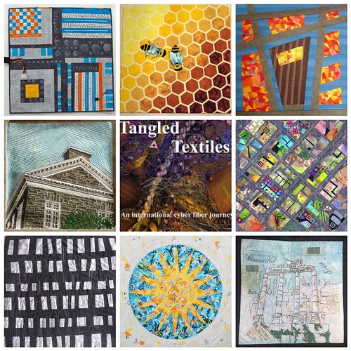
Tangled Textiles, challenge 7; architecture
We all await anxiously to hear from Vicki for word of our eighth challenge!!!!

Wednesday, August 15, 2012

its all about the details

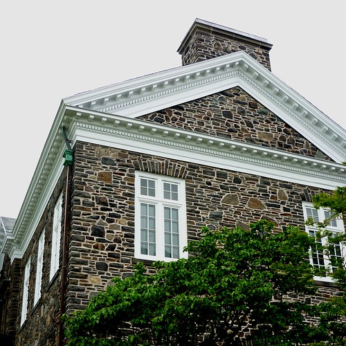
at least it is for  me!  I'm very much one who likes the little architectural details, and older buildings have so much character.  When I was in Halifax, Nova Scotia earlier in the summer, I took some pictures of some of the older campus buildings at Dalhousie University.

The MacDonald Building, Dalhousie University, Halifax
This building, the MacDonald Building, was the University library at one point.  I really like the crispness of the white dentil trim against the stone walls.  The building was built in 1914.  This became the basis for my challenge quilt.  One thing that I've discovered in doing these challenges is that I am most comfortable working from a photo.  I have a hard time with abstract, and as much as I would like to give it a better try, I'm just not comfortable there very often, and usually do not like my results very much, so I stick in my comfort zone, although this time I did take markers to my finished quilt!
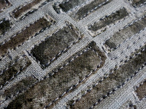
So here's my progress - working from an enlarged photograph, I sketched out my pieces and started cutting fabric.  I had this great brickwork fabric in my stash, but it was  a little too regular a pattern, so I applied fusible web to it and then cut it up in much smaller, random size pieces, and applied them to my background - a combination of one of my hand dyes for the sky and a medium grey, which became the grout lines.


starting point
the starting fabric
brickwork
the resulting fabric
I then added white and a darker grey to create the background and shading for some of the trim areas.  Many itty bitty little pieces later, I was progressing well.


progress
progress

I added lots of little pieces of a couple of greens to create the bush, and used a layer of green tulle over them before quilting them down.  A lot of the detail in the trim was added with some thread painting and the quilting, but I was at a loss as to how to quilt the sky until I decided to just echo quilt it. with straight closely placed lines.


free motion foot

but it was still missing some shading and some of the finer details,

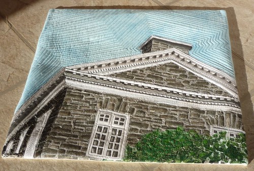
so out came my gel pens and markers, and with nary a hesitation, I attacked my finished quilt! I'm very pleased with how it has turned out!  (not so pleased with this picture - the sun was shining so brightly but I'm not really complaining!)


The MacDonald Building
The MacDonald Building in fabric
different angle

Thank you Nicolette for a really fun challenge!

Happy quilting!


Bird's Eye View

Upon hearing the choice of theme for this challenge, I was excited about all the possibilities and decided I would base my inspiration on computer architecture. After looking at images of motherboards I was less than thrilled with this decision and decided to focus on "De Bijenkorf", the Beehive department store in the Hague, Netherlands. I was enthralled by the unusual stained glass windows and was going to use the mosaic technique to approximate one of the window designs.  However, after contemplating how much work that would be, I gave up on that idea. I next considered using the floor plan of our home, which is a rather unique design but also abandoned that inclination.

A family member suggested the Walt Disney Performance Hall in Los Angeles. This would have been a most interesting challenge and lead me to look for various views of the hall, which lead me to an aerial view of the city which resulted in the solution to the challenge.

Bird's Eye View

My aerial view is in no way an accurate depiction of downtown Los Angeles, but hopefully it gives the feeling of a bird's eye view of the city. Construction details can be view here.


Nature's Little Architects


When Nicolette announced this theme, my first thought was to depict a well-known building or bridge.  But naw, I wanted something to add to the challenge of the theme.  Okay call me crazy.  So then I thought about using a landmark…that’s a structure right?  I thought about several possibilities and considered Stonehenge might work.  A friend had suggested it when she learned that I was having trouble picking something.

My epiphany came while watching a nature program about bees.  No I’m not inclined to watch nature programs.  I was channel surfing and there was nothing else worth watching... but I digress.  At one point the announcer said “watch nature’s little architects busily working within the hive…” That was all it took. 

So here is my depiction of the architecture of the inside of a hive with the  “little architects” busy at their construction.

I was at a bit of a loss on how to create the little critters, but some felt, angelina and embroidery floss did the trick.  Here is a close up of the bees.
During this challenge I learned some valuable lessons.  Besides the lesson "start earlier" I also learned to experiment a lot more with various "supplies" to achieve the look I was attempting to portray.  Stitching through fused fabric by hand was not an easy task; another lesson.  Final lesson learned...your quilt really does tell you what it needs, if you only listen. 

I ready to listen to what the next quilt is going to tell me.

Gigabyte- Beverly

  Gigabyte, 16 x 16
Commercial cottons, machine pieced and quilted, stamped, embellished with computer parts
 
While I liked the idea of a challenge piece based on architecture, I really wanted to do something other than buildings.  I thought of landscape architecture, but nothing grabbed me with that one either.  I looked up the definition of architecture in Wikipedia, and the last bullet intrigued me: 

The term "architecture" has been adopted to describe the activity of designing any kind of system, and is commonly used in describing information technology

 So I looked up 'computer architecture', and found this:

  computer architecture is the practical art of defining the structure and relationship of the subcomponents of a computer.


That got my attention- but I had not a clue what the insides of a computer looks like!  My oldest son, who is also my long-distance computer tech support, advised me to google 'gaming computers'.  I did, and felt like I had struck gold.  After printing off and considering several images for inspiration, I settled on this one.


I've had the text fabric in my stash for over a year, and this seemed like the perfect piece for it.  To me, the text represented communication, and computers have become such a large communication tool in my lifetime.

I wanted the quilting to have a 'techno' feel to it, so I used a straight line form of stippling.  Yikes, keeping the scale the same was a challenge!


My other technie family member, brother Paul, sent me some real computer parts that he had laying around.  the one above was attached to eighteen or so inches of gray wire, which I played with using.  I finally decided that all that wire was just too much, and cut off the two ends and used them.  The Whiother piece I used it its entirety.

 While I wouldn't say this is one of my best pieces, I had fun making it and stepping outside my usual nature-based inspirations.  I think this one will also end up mounted on a painted canvas.

Fantsy Sunset Reflection, Oceanside

This has been another fun challenge! Here is how my architecture piece evolved.... after many, many sketches of ideas I settled on this as my starting point.....
While spending time on the west coast in July I was mesmerized by the gorgeous sunsets over the ocean so gravitated to bright yellows, oranges, reds and ocean blues so I started creating a background of wavy blues...you may have seen this posted earlier as my 'false start'....
.. but realized that wouldn't work so set those aside and stitched a couple blues together in strips as if boards on a house. 
Then I experimented with how I would represent the sunset reflecting in the windows ..... I sampled water colour pencils on water colour paper and stitched to fabric which remained an option. Then I tried water colour pencils on fabric but that was not bright enough for me.
I may return to that idea of water colour paper stitched to fabric for another project but I decided on a crazy mosaic-like patchwork. I cut and laid tiny bits to fusible web. I wondered if I would regret not having put the fusible web onto each of the fabrics and cut those, thus creating less ravelly edges and less need to stitch like crazy to hold the edges down but I'm happy with my choice as it gives a more rustic feel to the piece. I started with more yellow in the center which would become the center of the sunset and also the reflection on the door window.
I drew a pattern so I could cut out the pieces to fit our designated 16 by 16" size.
I pieced the door with two different browns. Later I cut out the window and laid the reflection under the door to create the window.
Suddenly dozens of options appeared as I started laying out the windows and beams. Perhaps I should have one long window on one side, should it come to the ground or should there be blue at the bottom, should the top beam be horizontal or should it slope, etc, etc. I took dozens of photos of different layouts. Below are just a few.


Decisions finally made so I started sewing. I used clear thread to stitch like mad the little bits down on the windows, satin stitched the window pane lines and around the windows, created little wooden beams to go around the door window and opted for a machine stitched handle. (no wood carving or hand embroidery B and J!)
When the blue had seemed too bright I was thinking I would add some paint at the end to scruff up the house but I decided that I liked the bright look as after all I had begun to think of this as my "Fantasy Sunset Reflection, Oceanside". I did add a little touch of gold and red sparkle paint to bits of the windows.
So completed my architecture challenge piece! Now I'm thinking should I hang it from some driftwood? Perhaps a piece at the top and another at the bottom? What do you think? 
Thanks so much Nicolette for a great challenge! Just seeing all those incredible inspiration photos was fun and then letting those inspire a piece was great!

a star for Gaudí and Jujol

No houses, buildings, landscape architecture, skylines, or hill-top villages from the Provence. I considered all these ideas to discover that it was very difficult to work on the theme that I suggested myself!
detail of the center of the quilt
One of the meanings of Architecture is Construction. I wanted to try a new quilt construction technique and was inspired by the mosaics in Park Güell (Barcelona), a park designed and built by Antoni Gaudí and partly decorated by his co-worker (fellow architect) Josep Maria Jujol.


There is a lot of confusion and discussion going on on the internet about who actually made the mosaic ceilings of the Hypostyle Room in the park, Gaudí or Jujol. I have an Art History book about Gaudí that says that the ceiling mosaics were made by Josep M. Jujol, so I stick to that.

a star for Gaudí and Jujol
It was my first ever fabric collage/mosaic made of pieces this tiny. For the circle I used templates of fusible web and after I ironed all the little fabric pieces onto this web I cut them out and fused the shapes (center circle, starry points and negative spaces) to the background fabric. The  fabrics around the circle are all glued to the background after I used some basting spray. I chose to quilt it very densely to prevent the little fabric pieces from getting loose. The edge is finished with a blanket stitch.

It was a lot of fun, but I don’t know if I will ever ‘construct’ another collage/mosaic quilt!

Nicolette

Quaintly contemporary

You would have thought that after spending TWO whole weeks in New York City this past June, I would have had plenty of architectural inspiration
.... and you are right!

But that did not make this challenge any easier!!!!

I hemmed and hawed for weeks until I just started sewing....

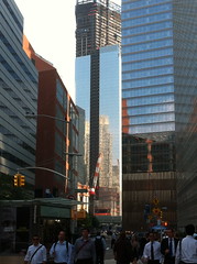
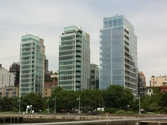
Inspired by all the contemporary (modern), glass buildings.....

glass glass my inspiration....

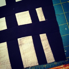
 I began sewing with black Kona cotton and pewter silk dupioni (my first time using the dupioni)....


a building


but when my building was pieced (and I did not take a photo of it! ACK), 
I wasn't sure what to do next.... it looked too simple

So I went back to all my photos (I took 401!) of  NYC 
...okay, all my photos of the buildings of NYC (surely there were only about 100!)
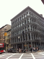
and I kept coming back to this wonderful quaint (charmingly old-fashioned) building
that I spotted in Soho while waiting for PurlSoho to open
(note to other shoppers: they don't open until NOON!)....


my inspiration...

 The details and the texture make me swoon!

It gave me an idea.... 
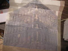
so I posterized the photo onto tracing paper so it would be thin to sew on (yes, sew on!)

building printed on tracing paper


and then temporarily adhered it to a similarly sized piece of Golden Thread tracing paper and sewed some of the details of the building onto the golden paper...


stitching the building onto golden paper (underneath)

et voila!!!
stitched golden paper

What next, you ask?! 

  I ran out and bought a pounce pad and some pounce (white) powder
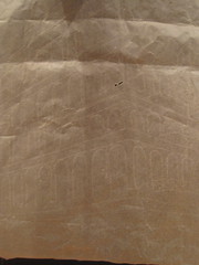
and pounced the design onto the back of the quilt...

I am pouncing!!!


which then looked like this... (or as we say in France, comme ca!)

pounced design on the quilt back

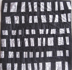
I then quilted from the back using a gray variegated thread in the bobbin and 
so 
we
have...
a little simple
a little subtle
it's
quaintly contemporary!!
Tangled Textiles, challenge 7: Quaintly contemporary
(I have discovered that it is very difficult to snap a good photograph of a square quilt!)

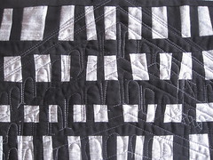
with a close up....

Tangled Textiles, challenge 7: Quaintly Contemporary
old and new!


arch i textiure

My challenge piece started out a few months ago as a piece for 'Balance' however I didn't get very far, before I was overtaken by another idea and this was left in the UFO box.
It was started after watching a Kelli Perkins workshop.  Yes, Kelli Perkins, Lisa, I was just uploading my picture when I saw your upload!.
I sketched these architectural elements, then painted them and added some bits of collage.  Then I printed them on fabric several times and patched them together so I had some nice frayed edges.  I free machined over my sketch lines, then went to town with hand stitching!
It's a bit hard to see the hand stitching in this photo, but it is pretty well covered.  In fact. I did so much hand stitching, I forgot all about quilting, so it is just backed with felt.
Hope you like it.  I sure enjoyed it.  Looking forward to seeing everyone else's!
Nearly bedtime here, and tomorrow I have a workshop, but hope to check in during the day.